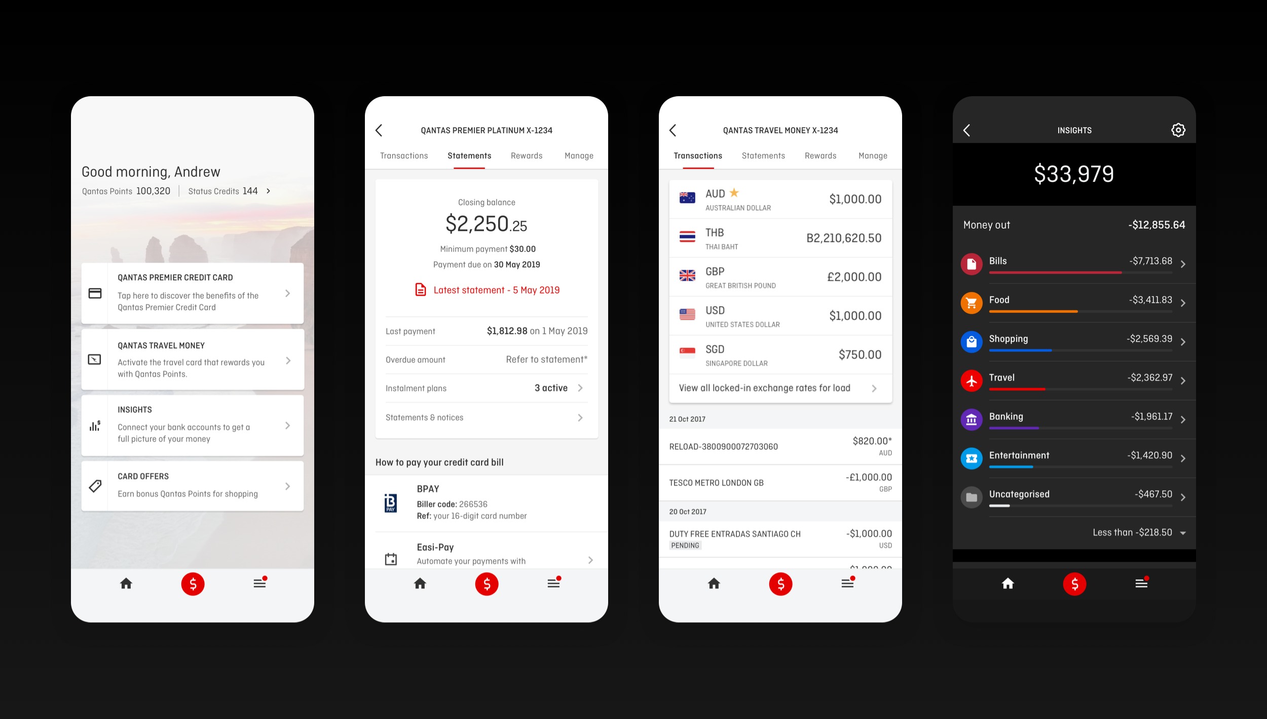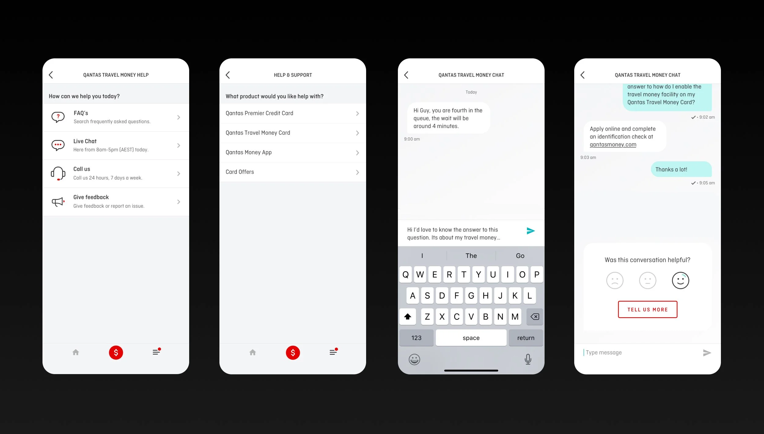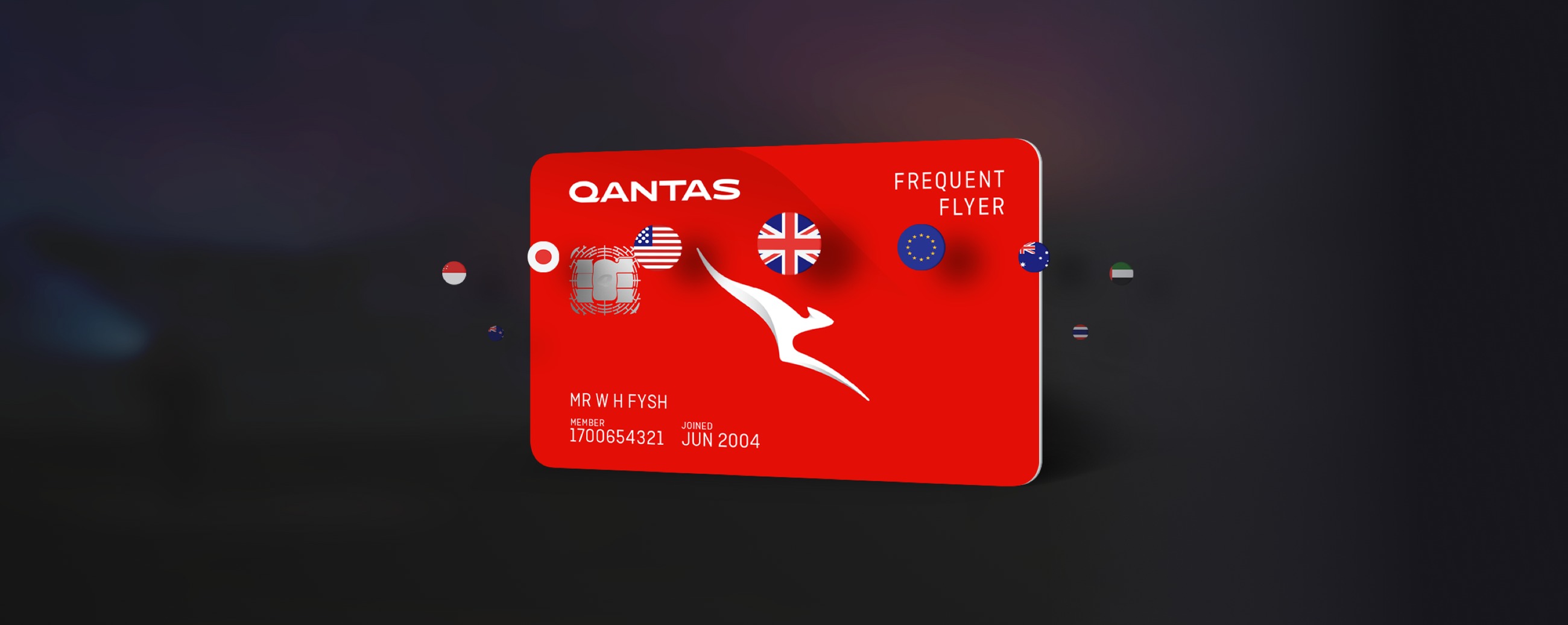
Qantas Money is the fintech arm of Qantas Loyalty, offering credit and travel cards that turn everyday spend into points, plus tools to track and manage money on the go, at home or abroad.
Case Study
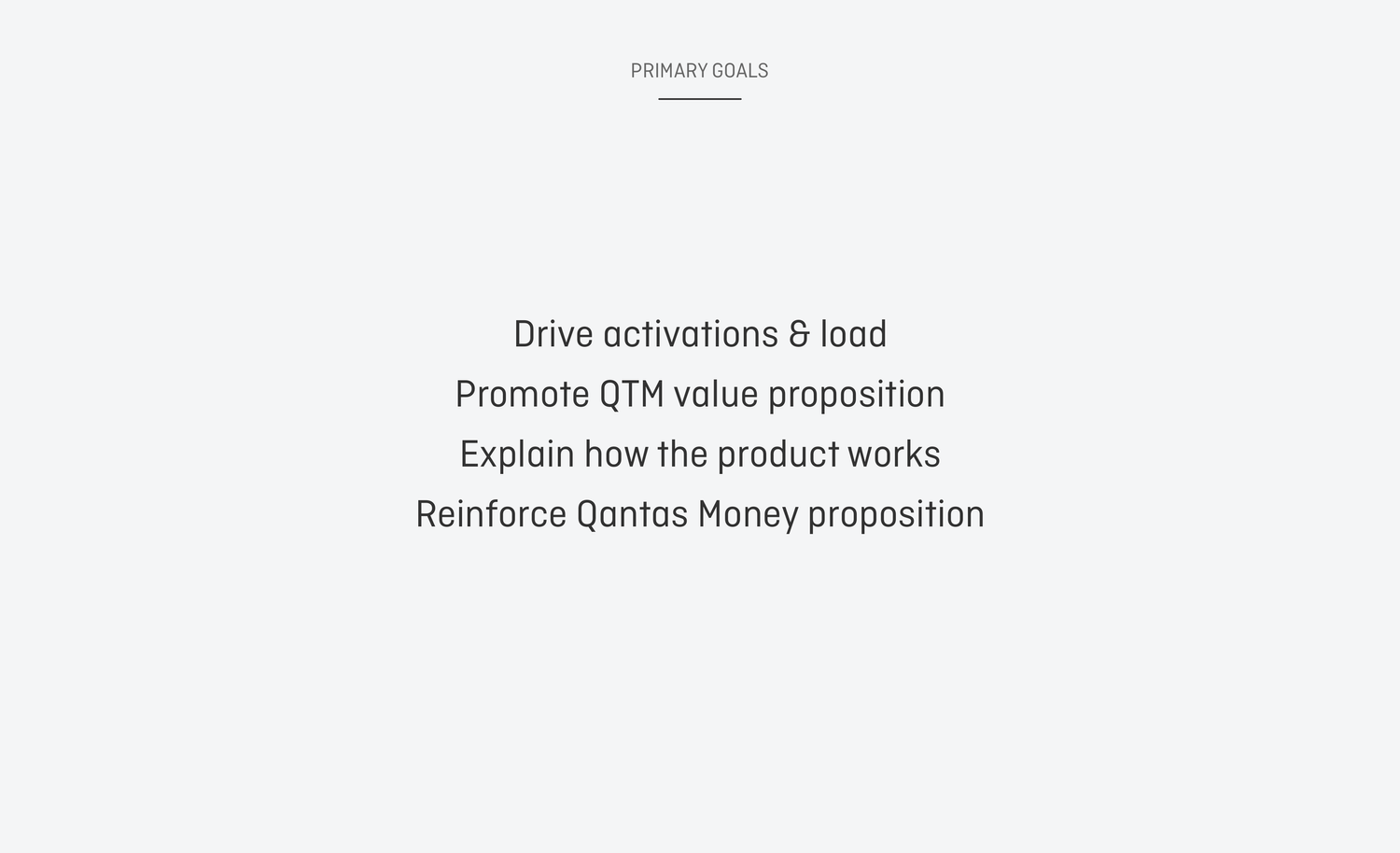
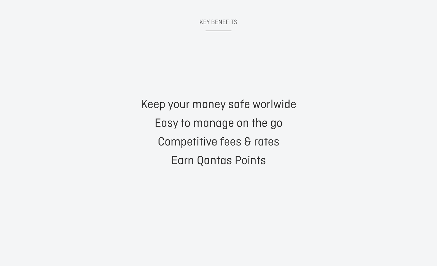
Brief: Design the user experience and interface for the Qantas Travel Money card website, a customer-facing surface that needed to feel premium, useful, and unmistakably Qantas.
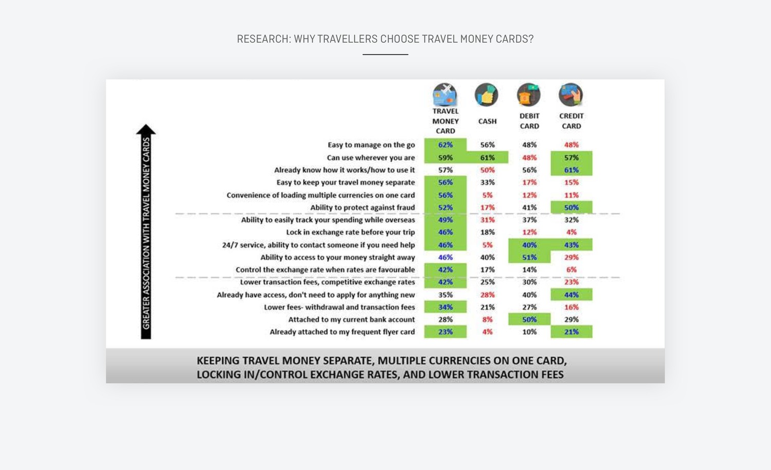
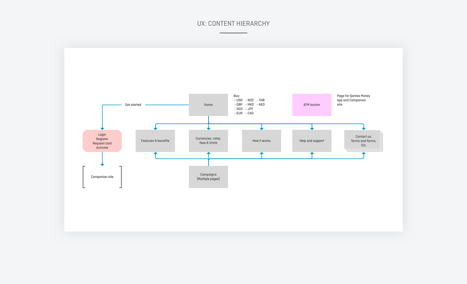
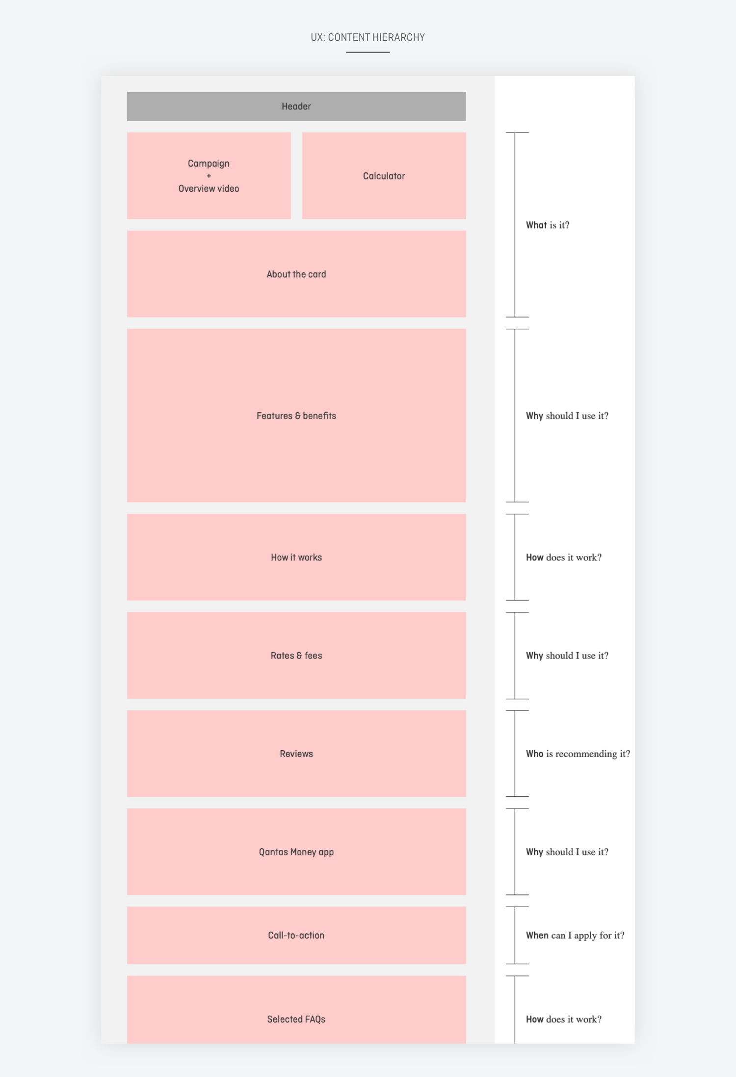
Approach: Worked closely with stakeholders to unpack requirements and business goals, consolidated existing customer research to anchor the experience, and defined the visual language and tone of voice across the site.
I follow the double-diamond creative process, guided by customer activity, pain points and feedback. Agile methodologies: research, design, learn, repeat.
Question and inform the product brief, set requirements and business objectives, and get backing from the business to kick-start the initiative.
Diverging. Testing strategy. Quantitative and qualitative. Continue to refine data findings to support design thinking.
Draft hypothesis and validate with customers. Test, iterate, test, repeat.
Consolidate learnings, enhance designs. Play back to business. Get ready to roadmap.
Technical design for development. Build, test, iterate.