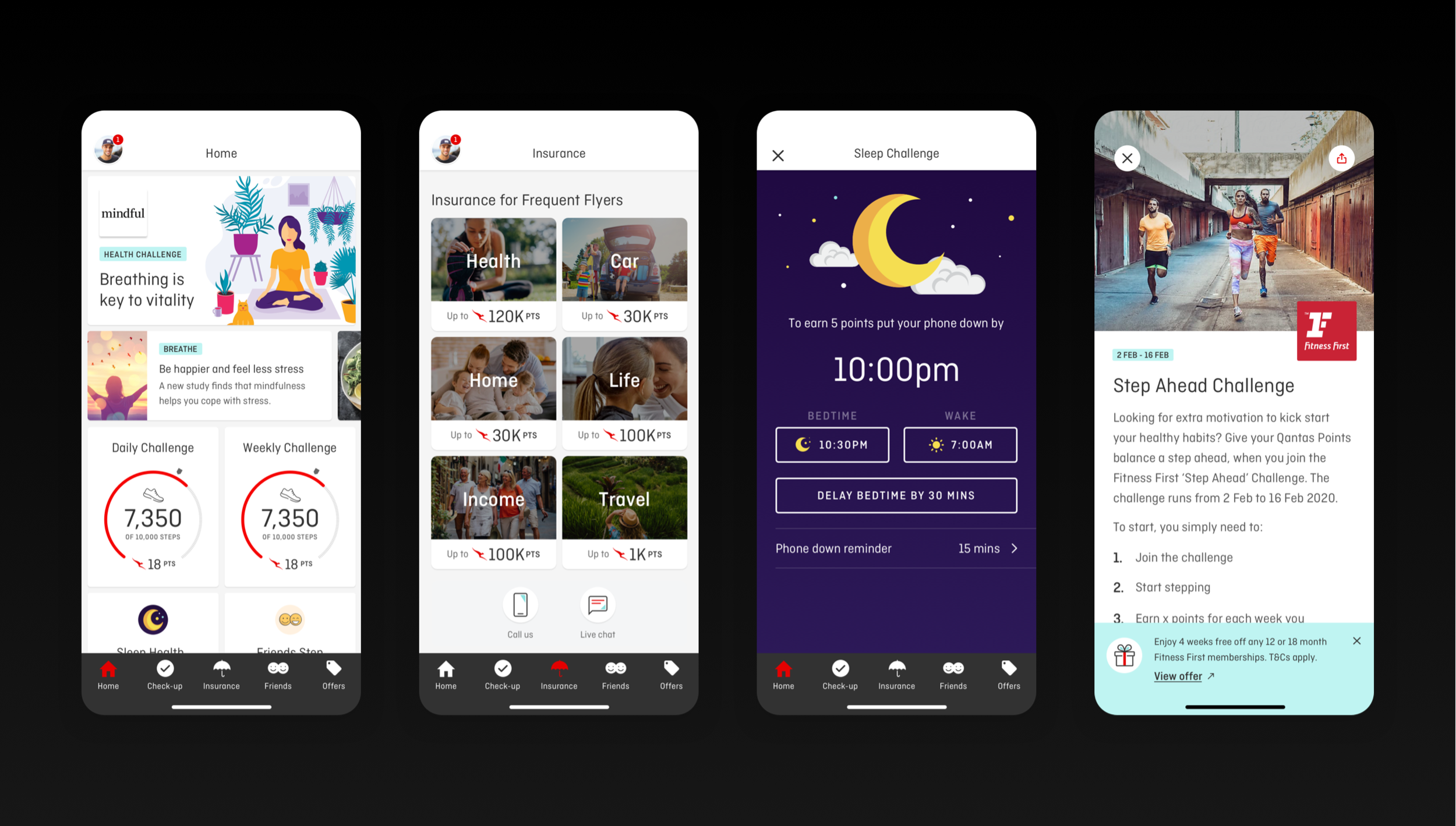
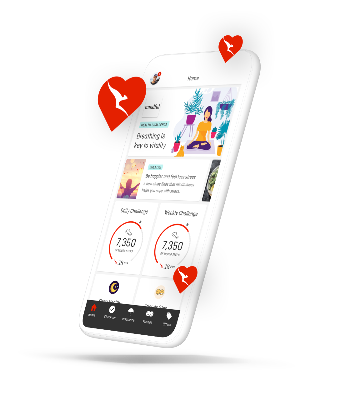
Insight: The Wellbeing app already had a loyal audience, with 100K+ MAUs engaging daily with points, challenges, and self-tracking. Many of them were already Qantas Insurance policy holders, but few realised the app could help them manage those policies.
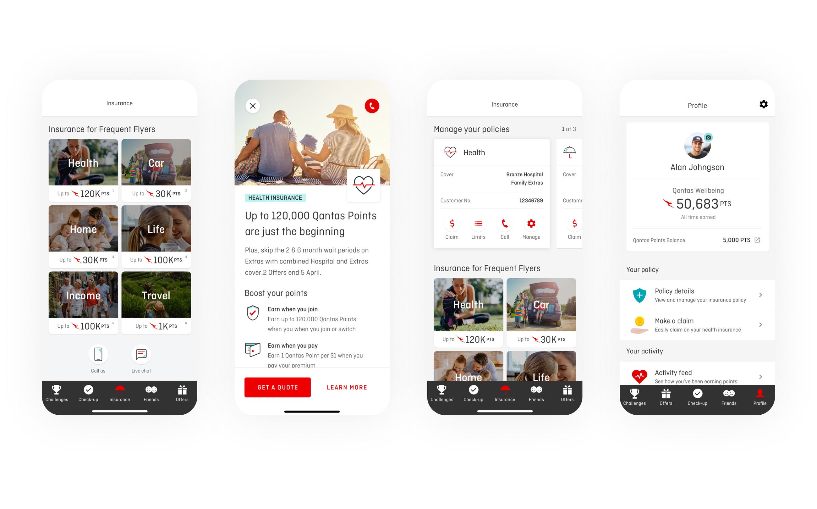
Opportunity: Use the wellbeing surface to lift insurance awareness, communicate value, capture leads, and expose existing self-service capabilities, without diluting the wellbeing experience.
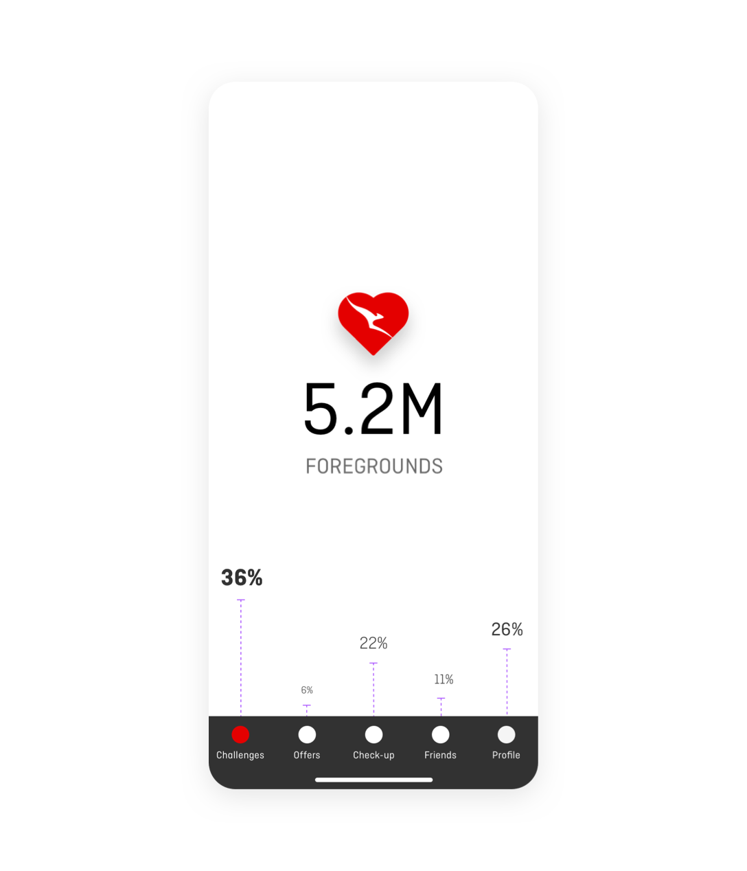
Approach: Two parallel research tracks. First, a deep read of in-app behavioural data to map engagement patterns and segment users. Then qualitative usability sessions to stress-test concepts with real customers, iterate, and re-test.
Adding an Insurance tab landed positively across the board. Participants liked managing all their Qantas products in one place. None of the existing policy holders (n=4) knew the current app already let them access extras limits, but they responded well to the proposed designs. For prospects, the points proposition paired with a competitive price proved a strong hook.